
You finish designing a poster on your screen. The colors look sharp, bright, and full of life. Then you print it, and everything looks dull, darker, and slightly off. This situation happens more often than people expect, especially when dealing with CMYK vs RGB printing.
This gap between screen vs print colors often confuses both beginners and experienced users. What looks perfect digitally can shift once it hits paper. The issue becomes more noticeable in marketing materials, photos, or anything with bold tones.
A common example: a vibrant red on your monitor turns into a deeper, less striking red after printing. That mismatch falls under digital colors vs printed colors, and it links directly to how color systems work.
The core difference lies in color modes in design. Screens rely on one system, while printers rely on another. This is where CMYK vs RGB printing becomes critical.
Anyone working with design files, even for simple home printing, needs to handle color modes correctly. Skipping this step often leads to unexpected results and wasted prints.
What Is RGB Color Mode?
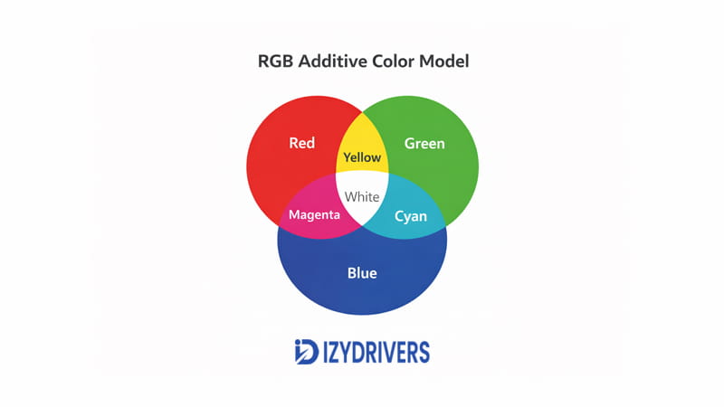
RGB stands for Red, Green, and Blue. This system builds colors using light instead of ink. It follows an additive approach, where combining light creates new colors.
In CMYK vs RGB printing, RGB represents the digital side. Every screen—laptops, phones, and TVs—uses the RGB color model to display visuals.
This system starts from black and adds light to create colors. The more light combined, the brighter the result. That’s why colors on screens often appear more vivid compared to printed output.
The additive color system allows screens to produce highly saturated tones. Bright greens, neon blues, and glowing reds all come from light blending.
How RGB Creates Millions of Colors
RGB works by mixing different intensities of red, green, and blue light. Each color channel can vary, producing a wide range of combinations.
On digital devices, colors appear through this light blending process. It enables smooth gradients and sharp color transitions. The display controls how much of each light is used to form a final color.
On monitors, phones, and TVs, the RGB system combines red, green, and blue light to produce many variations. Since it relies on light, the result appears brighter and more vibrant than ink-based systems.
This explains why RGB dominates in CMYK vs RGB printing discussions. It handles visuals that depend on brightness and glow.
Common Uses of RGB Color Mode
RGB is used across all digital platforms. It fits environments where content stays on screens.
Typical uses include:
- Website graphics
- Mobile applications
- Digital presentations
- Social media images
These platforms rely on RGB for digital screens, where brightness and clarity matter most.
In CMYK vs RGB printing, RGB remains the default for anything not intended for physical output.
What Is CMYK in Printing?
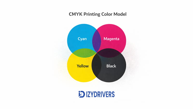
CMYK stands for Cyan, Magenta, Yellow, and Black. This system builds colors using ink instead of light. It follows a subtractive approach, where colors form by absorbing light.
In CMYK vs RGB printing, CMYK handles the physical output. Printers use this system to transfer designs onto paper.
Unlike RGB, CMYK starts from white (the paper) and reduces light reflection through ink layers. Each color added changes how light interacts with the surface.
The subtractive color model limits how bright colors can appear. Ink cannot replicate the glow that screens produce, which leads to noticeable differences.
How Printers Produce Colors
Printers create colors by layering tiny dots of cyan, magenta, yellow, and black ink. These layers mix visually when viewed from a distance.
Each ink absorbs part of the light hitting the paper. The remaining reflected light determines the color seen by the eye.
In printing, the CMYK system works with ink on paper. The ink absorbs some light and reflects the rest, which leads to softer and less vibrant colors compared to screens.
This process defines the CMYK printing process and explains why results look different from digital previews.
The role of printer ink colors also matters. Ink quality, density, and layering all influence the final output.
Typical Applications of CMYK Printing
CMYK is used for all physical print materials. It is the standard for anything produced on paper or packaging.
Common applications include:
- Brochures
- Flyers
- Posters
- Magazines
- Packaging materials
These use cases rely on the subtractive color model, which works within the limits of ink and paper.
In CMYK vs RGB printing, CMYK becomes essential once a design moves from screen to print.
CMYK vs RGB Printing: Key Differences Explained
The gap between screen visuals and printed output becomes clear once you compare how each system works. In CMYK vs RGB printing, the difference is not minor—it directly affects brightness, tone, and overall accuracy.
Many users assume a design will look identical after printing. That expectation leads to frustration when colors shift. The root cause always comes back to how RGB and CMYK handle color creation.
This section breaks down the real differences in CMYK vs RGB printing, focusing on how each system behaves in practical use.
The Fundamental Difference Between RGB and CMYK
RGB creates color using light. CMYK creates color using ink. That single difference explains most issues seen in CMYK vs RGB printing.
RGB follows an additive model. It starts from black and adds light to build colors. When red, green, and blue light combine fully, the result appears white.
CMYK follows a subtractive model. It starts from white paper and uses ink to block light. Each layer of ink reduces the light reflected back to the eye.
Screens emit light directly toward your eyes. This makes colors appear bright and vibrant. Printers, on the other hand, rely on reflected light from paper, which limits intensity.
In CMYK vs RGB printing, this contrast between emitted light and reflected light changes how colors appear. Even with the same design file, the output will not match perfectly.
Color Gamut Comparison
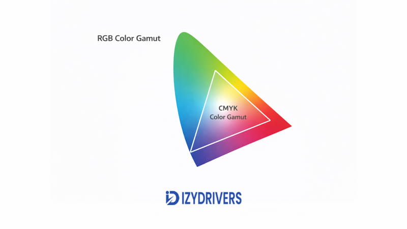
Color gamut refers to the range of colors a system can produce. This is where the difference becomes more obvious in CMYK vs RGB printing.
RGB covers a wider color range. It can display bright greens, neon tones, and deep blues that stand out on screens. These colors rely on light intensity.
CMYK has a more limited range. Ink cannot recreate the same brightness or saturation. As a result, some colors lose their impact during printing.
One major reason behind this shift comes from the wider range of RGB. Many bright tones visible on a screen cannot be reproduced accurately with ink. Printed results often appear darker or less saturated.
This limitation explains why color adjustments are necessary when preparing files for print in CMYK vs RGB printing.
RGB vs CMYK Comparison Table
| Feature | RGB | CMYK |
|---|---|---|
| Color model | Additive (light-based) | Subtractive (ink-based) |
| Primary use | Digital displays | Physical printing |
| Color range | Wider color gamut | Limited color range |
| Brightness | More vibrant | Less luminous |
| Common usage | Websites, apps, graphics | Posters, flyers, magazines |
This table highlights the core differences in CMYK vs RGB printing. Each system serves a specific purpose, and mixing them without adjustment leads to mismatched results.
Practical Impact on Printing Results
The most noticeable effect in CMYK vs RGB printing shows up during actual printing. Colors that look strong on screen often lose intensity on paper.
Designs created in RGB tend to shift when printed. Reds become deeper, blues lose brightness, and greens appear muted. Neon tones rarely translate well to ink.
For photo printing, the difference can affect skin tones and lighting balance. A photo that looks clean on screen may print with darker shadows.
In marketing materials, color accuracy matters even more. Brand colors can shift, making logos appear inconsistent across print and digital formats.
Posters often show the biggest gap. Large areas of color highlight any mismatch between screen and print output.
These real-world issues are a direct result of CMYK vs RGB printing differences. Without proper adjustment, the final output rarely matches expectations.
Why This Difference Matters for Designers and Printer Users
For designers, ignoring CMYK vs RGB printing leads to unreliable results. Color consistency becomes difficult to maintain across platforms.
Design files prepared in RGB may look perfect during editing but fail during printing. This creates extra work, especially when revisions are needed.
Home printer users face similar problems. Simple projects like photos or flyers can turn out darker or less vibrant than expected.
Professional printing requires even more precision. Commercial printers rely on CMYK settings to control color output. Incorrect color modes can affect entire print runs.
Understanding CMYK vs RGB printing helps avoid wasted materials, time, and effort. It allows better control over how designs appear in both digital and physical formats.
Why Colors Look Different When Printed
Even with the right settings, printed colors rarely match screen visuals exactly. The difference comes from how light interacts with each medium.
In CMYK vs RGB printing, several factors influence how colors shift from screen to paper.
Screen Brightness vs Paper Reflection
Screens produce their own light. This makes colors appear bright and highly saturated.
Paper does not emit light. It reflects light from the environment. This reflection reduces brightness and changes how colors are perceived.
This contrast plays a major role in CMYK vs RGB printing. What looks vibrant on screen often appears softer on paper.
Ink Limitations in Printing
Ink cannot match the intensity of light. It absorbs and reflects light instead of generating it.
This limitation affects saturation and depth. Bright colors lose intensity, and dark areas can appear heavier.
These constraints contribute to color shift in printing, where the final result differs from the original design.
They also impact print color accuracy, especially in designs with bold or high-contrast colors.
Paper Type and Print Quality
Paper type influences how colors appear after printing. Glossy paper reflects more light, making colors look sharper.
Matte paper absorbs more light, which softens the overall appearance. This affects color reproduction across different print materials.
Printer quality also plays a role. Higher-end printers handle ink distribution more precisely, improving consistency.
All these factors combine to shape the outcome in CMYK vs RGB printing.
When to Use RGB vs CMYK
Choosing the correct color mode depends on the final output. In CMYK vs RGB printing, each mode serves a different purpose.
When RGB Is the Best Choice
RGB works best for anything displayed on screens. It delivers brighter colors and sharper visuals.
Use RGB for:
- Website design
- Digital advertising
- Social media graphics
These platforms rely on light-based color systems. RGB ensures visuals appear as intended on digital devices.
In CMYK vs RGB printing, RGB remains the default for digital content.
When CMYK Should Be Used for Printing
CMYK is required for physical printing. It ensures colors are prepared for ink-based output.
Use CMYK for:
- Brochures
- Posters
- Business cards
- Packaging
These materials depend on ink and paper, making CMYK the correct choice.
In CMYK vs RGB printing, switching to CMYK before printing helps reduce unexpected color shifts and improves consistency.
How to Convert RGB to CMYK for Printing
Preparing a design for print requires more than just hitting the print button. The transition from screen to paper depends heavily on proper RGB to CMYK conversion. Skipping this step often leads to unexpected color shifts.
In CMYK vs RGB printing, conversion ensures your design aligns with how printers actually produce color. Working in the wrong mode can result in darker tones, muted colors, or loss of detail.
The goal is simple: adjust the file so it behaves correctly once ink is applied to paper.
Converting in Adobe Photoshop
In Photoshop, start by opening your design file. Go to the top menu and select Image > Mode, then switch to CMYK Color.
This step changes how the file handles color data. It allows you to preview how colors will appear when printed.
After switching modes, review the image carefully. Some colors may shift immediately. Bright tones often become less intense.
Adjust levels, curves, or saturation if needed. These tweaks help balance the result before printing.
This process plays a key role in CMYK vs RGB printing, especially for photo-based designs.
Converting in Adobe Illustrator
Illustrator uses a slightly different approach. Instead of converting individual elements, you set the document mode.
Go to File > Document Color Mode, then select CMYK Color. This ensures all elements follow print-ready settings.
If the design was created in RGB, some colors may not translate directly. Gradients and bright tones need extra attention.
Always check color values after switching modes. Small adjustments can improve consistency.
Proper setup in Illustrator supports smoother results in CMYK vs RGB printing, especially for vector designs.
Exporting Print-Ready Files
After conversion, exporting the file correctly is just as important. Choose formats like PDF, TIFF, or EPS for reliable output.
These formats preserve color data and layout. They are widely accepted in professional printing.
Double-check color settings before exporting. Ensure the file remains in CMYK mode throughout the process.
Accurate print-ready files reduce the risk of color shifts during production. This step is often overlooked but has a direct impact on final output.
A clean RGB to CMYK conversion combined with proper export settings improves consistency in CMYK vs RGB printing.
Tips to Get Accurate Colors When Printing
Even with correct settings, achieving consistent results requires attention to detail. In CMYK vs RGB printing, small adjustments can make a noticeable difference.
Use the Correct Color Profile
Color profiles control how colors are interpreted between devices. ICC profiles help match what you see on screen with what gets printed.
Printers and papers often have specific profiles. Using the right one improves color consistency.
Without proper profiles, designs may appear different across devices. This affects accuracy in CMYK vs RGB printing.
Calibrate Your Monitor
Monitor calibration ensures your screen displays colors accurately. Without calibration, you may edit colors based on an incorrect preview.
A calibrated display gives a closer representation of print results. It reduces guesswork during design adjustments.
This step is essential when working with CMYK vs RGB printing, especially for detailed or color-sensitive projects.
Print Test Copies
Before final production, always print a test copy. This process, often called proof printing, reveals how the design behaves on paper.
Test prints help identify color shifts, contrast issues, and overall balance. Adjustments can be made before printing in bulk.
Proofing is one of the most effective ways to improve results in CMYK vs RGB printing.
Conclusion
The difference between RGB and CMYK comes down to how colors are created. RGB uses light, while CMYK relies on ink. This gap explains why designs look different on screen and in print.
In CMYK vs RGB printing, each mode serves a specific purpose. RGB works best for digital content, while CMYK is required for physical output.
Ignoring this difference often leads to dull or inaccurate prints. Proper setup, conversion, and testing help maintain color consistency.
Choosing the right color mode before printing saves time, materials, and effort. It also ensures the final result matches your expectations.
FAQs About CMYK vs RGB Printing
Is RGB or CMYK better for printing?
CMYK is better for printing. It matches how printers apply ink to paper, leading to more predictable results in CMYK vs RGB printing.
Why do RGB colors look dull when printed?
RGB relies on light, while print uses ink. This difference reduces brightness, causing colors to appear less vibrant.
Can printers print RGB colors directly?
Printers can accept RGB files, but they convert them internally. This often leads to unexpected color changes.
Should I convert RGB to CMYK before printing?
Yes. Converting beforehand gives you control over how colors shift during printing.
Why do printed colors look darker than the screen?
Screens emit light, while paper reflects it. This difference affects brightness and overall color appearance.


